PSDTUTS Updates |  |

- Perttu Murto and the Art of Inspiration
- Freebie: 10 Social Media Icons
- Give a Yellow Lamborghini a Paint Job in Photoshop
- Quick Tip: Create a Seamless Wood Tile in Minutes
- The Making of Rapture – Psd Premium Tutorial
| Perttu Murto and the Art of Inspiration Posted: 11 Sep 2010 08:00 AM PDT Many of Perttu Murto's designs are brilliant entanglements of photography and illustration. In this interview the Finnish designer talks about his continuous quest for self-improvement and his passion for all things art…and hockey.
When discussing goals with people, the typical responses have something to do with where they want their lives to be in five or ten years. I have a feeling if I didn't phrase it as "professional goals" when speaking with Finnish designer and illustrator Perttu Murto, he would've gone into a monologue about ice hockey goals. That's an exaggeration, of course. But the idea behind it is not: Murto loves ice hockey. So much, in fact, that the vast majority of personal questions I asked him came back to the subject. It's only natural that a man who is so passionate about a sport is just as passionate about his art. 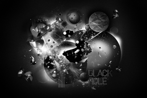 All in a Day's WorkMurto is 24-years old and lives in northern Finland in a city-by-the-sea called Oulu. He shares his life and apartment with his fiancé and two ("crazy") cats, one of which is his morning wake-up call. After giving in to the cat and going through his morning routine, Murto heads to his job at a local ad agency Työmaa, where he has been a Graphic Designer for three years. He loves the job and he loves working with "real professionals." The fact that it's a fun place to work is just icing on the cake. Even though he's got an "everyday" job, Murto still considers himself to be a freelancer…and a very in-demand one at that. Through his work at the agency he's had the privilege of working with some big-name clients like Nokia, Lappset, Polar and Warner Music, and his freelance design and illustration business has padded his portfolio with works for clients like UU Theory, UNICEF and Dolce & Gabbana.  Lifelong LearningMurto is finishing his final year at Oulu University of Applied Sciences Business and Information Management where he studies Digital Media. All that stands between him and his degree is his thesis which, along with his day job and nightly freelance work, will likely make his schedule even more hectic. Murto doesn't mind, though. As he puts it, "The best part is that I can [make] my living by doing what I love!" His first love, though, is hockey. Before he even started anything artistic, Murto had aspirations to become a professional hockey player. Now he plays on a recreational team but he doesn't mind because "these days it's not that serious." Nevertheless, he loves a good game. Murto saves all of that seriousness for becoming a better artist, something that he aspires to do for the rest of his life. One of the things he wishes to learn is the art of drawing more photo-realistically. He loves photography and, as one can tell, his art relies heavily on photos. Additionally, much of his work contains animal themes because as he explains, "I think that it will make the works more interesting when there is some kind of organic figure mixed with crazy stuff. I really want to use photos; I think that they are an important part of my work." This was the case with one of his favorite projects for which he was the art director: a tiger-themed CD cover for a band called Automatic eye. Always being open to learning something new is one of the most important lessons that Murto has learned so far. He spent 11 years perfecting his ice hockey game and his design and illustrations will no doubt receive the same level of dedication.
Patience is a VirtueLike many newbie freelancers, Murto found that he rushed many of his personal projects and they rarely turned out the way that he had hoped. "In my opinion patience is pretty much the keyword in this industry; you don't learn stuff from one sitting. It comes to you when you have time and patience to experiment and work, work, work." That patience is evident in the fact that Murto's work process has him starting from scratch each time, something that is common for many designers. "I take a pen and I print the brief. I start underline things and sketching. That's about it. I get some kind of an idea going on in the paper and then I start doing [the] first mockup with [a] computer." Saying that simplifies his process, though. In fact, the sketching step can last a while. "I sketch, sketch, sketch, twist, try, reform, duplicate and there is one point when I see that "ah, this is starting to look right!" It's at that point that the creation moves onto the computer where it is further transformed using mostly Illustrator, PhotoShop and InDesign. With life lessons comes a professional maturity that Murto has achieved in the few years that he's been out in the design world. While he always enjoys some good competition on the ice, he recognizes his limitations and won't hesitate to pass a project request off to an artist who is better suited for that job. He understands that trust and communication between himself and his clients are things that will go a long way to producing work that both client and artist are proud of. He isn't exempt from frustrations, however. One of his biggest challenges is when there are too many people involved in a project and too many opinions that lead to the entire project being chaotic and generally "bad." But, as always, Murto chalks that up to part of the game, so to speak. "But that's life and part of this job," he says. Murto finds inspiration from a variety of places. "Everywhere" in fact. "[It] could be a cool movie ("Napoleon Dynamite -so funny"), awesome songs, a great piece of art, annoying people, funny people, nature…. Pretty much everything around me." Communication is also a source of inspiration for Murto: "When the project goes well and everything works well together and the communication between our team (or me) and the client is working, the outcome usually is something great. That is also really inspiring."  Support SystemDespite his full workload, Murto finds time to relax with his loved ones. His "awesome" family consists of his very supportive parents and a sister with whom he is very close. They all have been extremely supportive in whatever endeavors Murto has taken on, whether it was of the creative sort (his mom is very creative) or of the athletic sort (his dad devoted a lot of time to his love of ice hockey.) They are very proud of everything that their talented son has achieved in such a short time. "They are happy that I got into design and art so [heavily] and found something [that] I am really passionate about." They are no doubt pleased that he found ice hockey at an early age as well since Murto describes himself as "a bit shy with people I didn't know really well. But really loud with the people I knew… I had [a lot of] energy going on, that's for sure!" That energy that was once used to outsmart the other team and score goals on the ice is now put into achieving his goal of artistic success. And this time there is no defensive line stopping him.  More From Perttu Murto 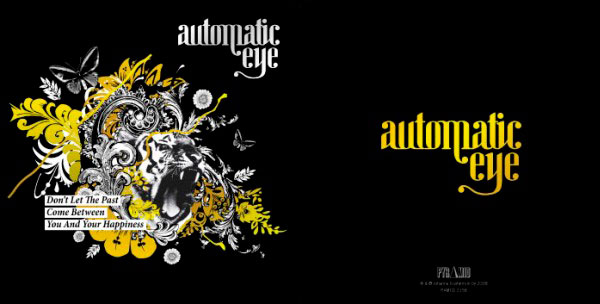 On the WebVisit Perttu Murto on the web. |
| Freebie: 10 Social Media Icons Posted: 10 Sep 2010 09:45 AM PDT Most designers are constantly in need of social media icons for their projects. Today, we have a nice set 10 social media icons for you to use in your next project.
10 Social Media IconsThis pack includes 10 high quality icons available in PNG format in two sizes including 64px, and 128px. These icons were created by La Glanz Studio and are royalty-free, so you can use them for any commercial or personal project. |
| Give a Yellow Lamborghini a Paint Job in Photoshop Posted: 10 Sep 2010 06:45 AM PDT With Photoshop, just about anything is possible. In today’s tutorial we will demonstrate how to give your yellow Lamborghini a quick paint job. Then, we will add some cool effects. Let’s get started!
Tutorial AssetsStep 1Open the Lamborghini image in Photoshop. Since the image is pretty large, you’ll need to resize it to 1680px by 1050px. To do this, go to Image > Image size or press Cmd/Ctrl + Alt + I on your keyboard.  Step 2Now, in the Layers palette, you need to unlock the "Background" layer. To do this double click on the "Background" layer, and call it "Base". 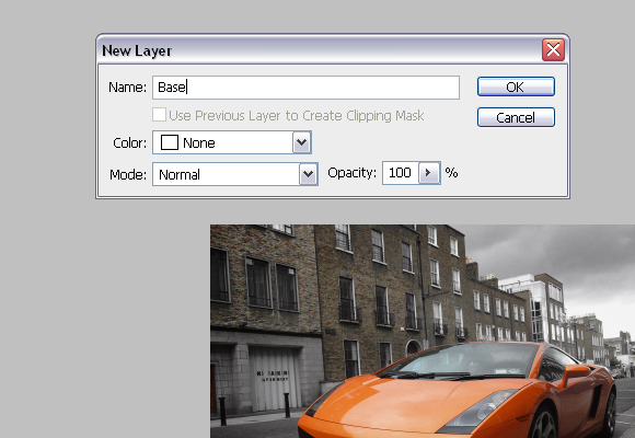 Step 3To finish with adjusting the image size, go to Image > Canvas Size or press Cmd/Ctrl + Alt + C on keyboard. In the Canvas Size windows, in the dropdown menu choose pixels for unit. For Height insert 1050 pixels. Click OK, and click Proceed on the new window, which alerts you that your image is larger than the canvas size. 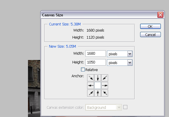 Step 4Using the Pen Tool (P), create a path around the car as shown below. Try to be as precise as possible. 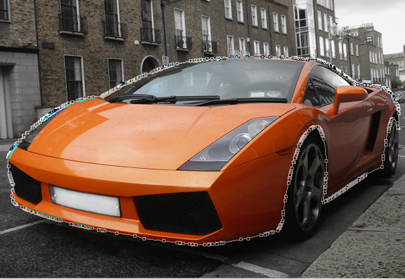 Step 5With Pen Tool (P) active right click and choose Make selection. For the Feather radius, set 0px. 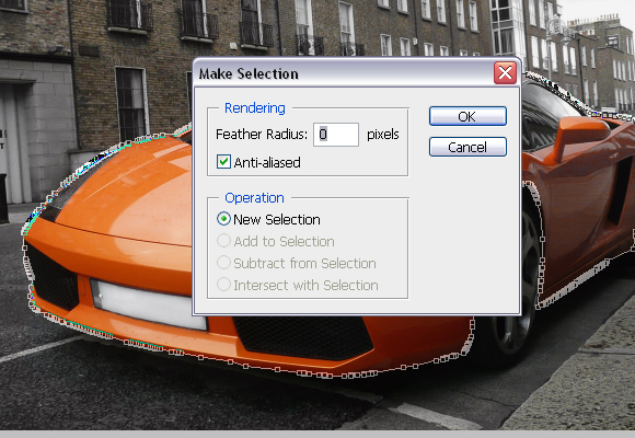 Step 6Usually, when you’re changing car’s colour, this step is not needed but since we are changing car’s colour to black it is. While, the car’s body is selected go to Image > Adjustments > Desaturate or press Cmd/Ctrl + Shift + U. DO NOT deselect yet. 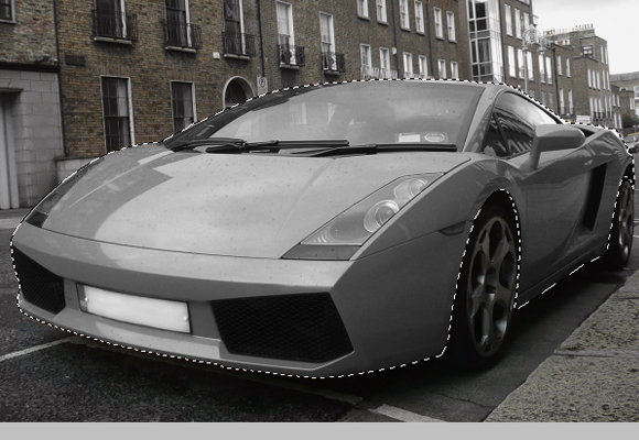 Step 7Using the Rectangular Marquee Tool (M), right click on the canvas and choose Layer via Copy, and rename the "Layer 1" to "Body".  Step 8Make sure that you’re on the "Body" layer, and go to Image > Adjustments > Replace Color. In the new window set the parameters as shown below, but DO NOT click OK. 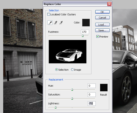 Step 9Now, click somewhere on the hood to choose the colour to replace, and start adding colours which will be replaced by tones of black. You’ll do this by Shift-clicking on the car’s body (but DON’T click on the glass, lights etc). The selection in the Replace color window should look like below. 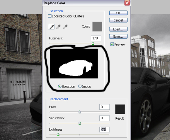 Step 10Now create a Vector mask for the "Body" layer. Using Pen Tool (P) make paths, which will be used to select registration plates, lights, mirrors and grill. 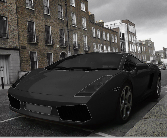 Step 11Right click with the Pen Tool on the canvas and choose Make Selection. For the feather radius insert 0px.  Step 12Using the Brush Tool (B), colour set to #000000, paint over selected areas on the mask of the "Body" layer. Image should look similar as shown below. 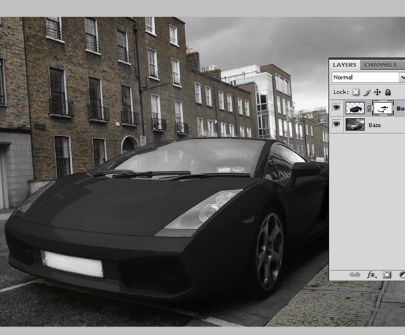 Step 13Now click on the “Base” layer’s thumbnail, and using Pen Tool (P), same as before, create path around rims of the car, right click, go to Make Selection, Feather radius to 0px, and click OK.  Step 14With Rectangular Marquee Tool (M) right click on the canvas and choose Layer via Copy. Rename created layer to “Rims”.  Step 15Now, while you’re on the "Rims" layer, go to Image > Adjustments > Replace color and this time set the Lightness somewhere around -60. Shift-click on the different parts of the rims to add more sample colours which are going to be replaced. The result should look as shown below.  Step 16Create new layer, just above “Base” layer and call it “Turn signal light 1″. 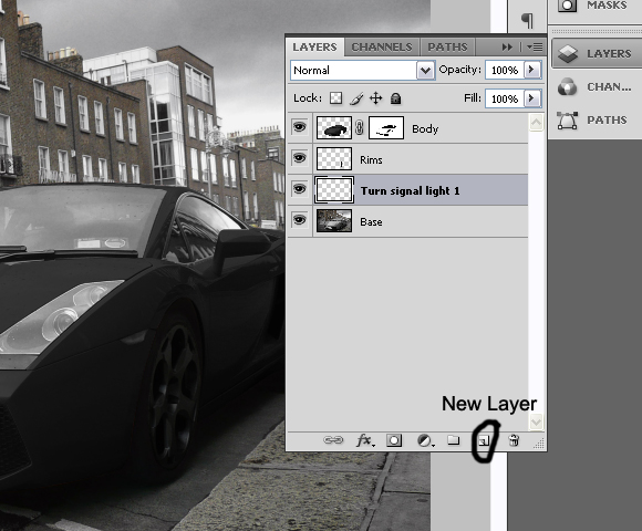 Step 17Using Brush Tool (B), with colour set to #e48223, Brush size 34px, Hardness 0%, paint on the turn signal light on front of the car as shown below. 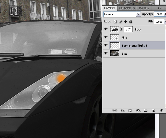 Step 18Now change the Blending mode for the layer “Turn signal light 1″ to Color and set the layer’s opacity to 31%. 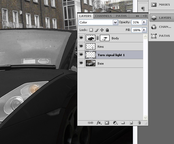 Step 19Create another layer above the “Turn signal light 1″, and call it “Turn signal light 2″.  Step 20Again, using the Brush Tool (B), with colour set to #e48223, Brush size 34px, this time Hardness set to 100%, paint over the turn signal on the side of the car as shown below.  Step 21Set the Blending mode for the “Turn signal light 2″ to Color and layer’s opacity to 74%. 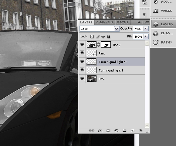 Step 22Set “Base” layer active (click on the layer’s thumbnail) and using Pen Tool (P) create path around the coloured part of the license plate. Right click, choose Make Selection and set Feather radius to 0px.  Step 23With Magic Wand Tool (W), and Substract from selection set, click on the letters until you deselect them from the selection. 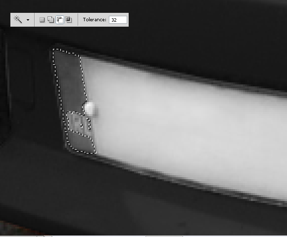 Step 24With Color Replacement Tool (B), with large brush, 100% Hardness, and colour set to #2343e4 paint over the selection until you finish with the following results. 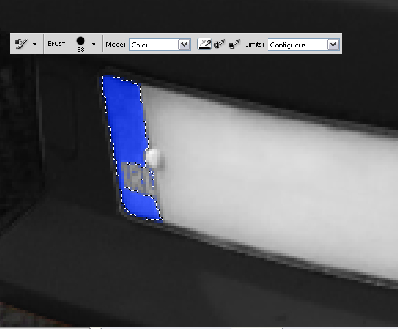 Step 25Now deselect by going to Select > Deselect or by pressing Cmd/Ctrl + D on keyboard. Using the Burn Tool (O), Range set to Shadows and Exposure to 17%; burn the grill on the front side of the car as shown below. 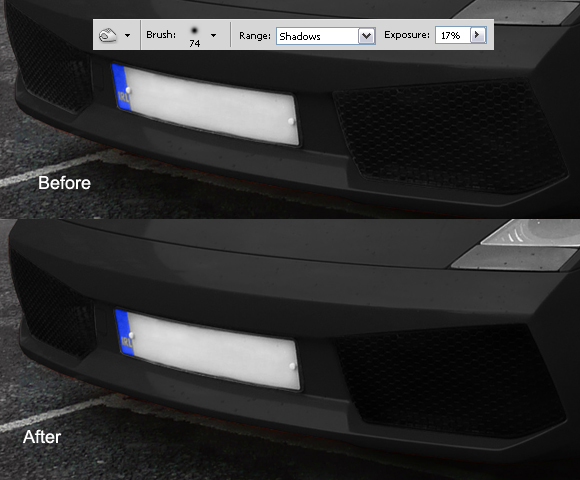 Step 26While still on the "Base" layer Cmd/Ctrl-click on the "Body" layer’s mask thumbnail to select mask. Go to Select>Inverse or press Cmd/Ctrl + Shift + I. You can use the Polygonal Lasso Tool (L), with Subtract from selection set, subtract everything except the windows from selection.  Step 27Using Burn Tool (O), Range set to Shadows and Exposure to 60% paint over the selection with big hard brush. Don’t deselect yet. Now, change the Range to Midtones and Exposure to 30%, and paint over the selection again. And finally, change Range to Highlights and Exposure to 15%, burn over the selection and deselect it by pressing Cmd/Ctrl + D or going to Select > Deselect.  Step 28Again, using the Burn Tool (O), Range set to Shadows and Exposure to 60%, Brush size 60px and Hardness 15% burn the wheels, space between car and the wheels and shadows under the car. 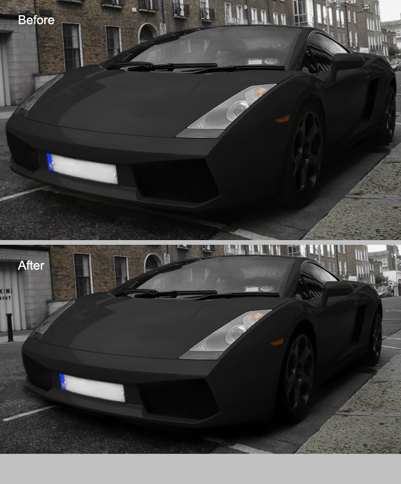 Step 29Select all layers, click the right click in the Layers pallet and go to Merge Layers. Rename the layer to the “Final Image”.  Step 30Duplicate the layer by pressing the Cmd/Ctrl + J on the keyboard. Now, while on the copied layer go to Filter > Blur > Motion Blur and set the settings as shown below.  Step 31Add a Vector mask for the copied layer, and using the Brush Tool (B), with pure black colour, diameter set to pretty high (around 130px) and Hardness to 0%, paint on the mask. The goal is to have blurred only the right part of the image, but not the Lamborghini as shown below.  Step 32Again, select all the layers, right click in the Layers palette and choose merge visible. Rename the layer to "Final image" again. 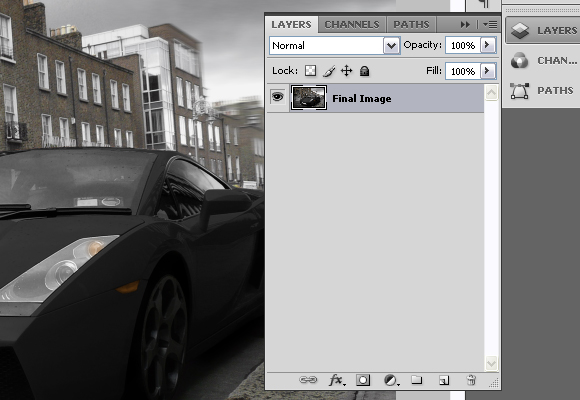 Step 33Now, using the Burn tool (O), Range set to Shadows, Exposure to 16%, Diameter 453px and 0% Hardness, burn entire image slightly. 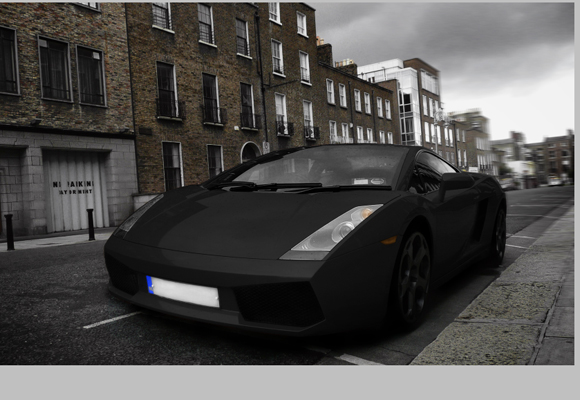 Step 34Now, let’s create the final effect and finish the tutorial. Go to Filter > Distort > Lens Correction. In the Vignette section, for the Amount set -100 and for the Midpoint + 28 and press OK.  Step 35Go to Channels palette and choose "Red" channel or press Cmd/Ctrl + 3 on keyboard.  Step 36Go to Image > Adjustments > Brightness/Contrast and for the Contrast set 50, and press OK.  Step 37Select "Green" channel or press Cmd/Ctrl + 4, and go to Image > Adjustments > Brightness/Contrast and for the Contrast set 50 again and press OK.  Step 38Now, go back to RGB mode or press Cmd/Ctrl + 2. 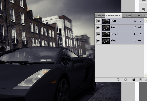 Step 39Create new layer, and rename it to “Orange”. Using Paint Bucket Tool (G), with colour set to #ff9600 fill the new layer. Set the Blending mode for the “Orange” layer to Overlay and Fill to 22%. 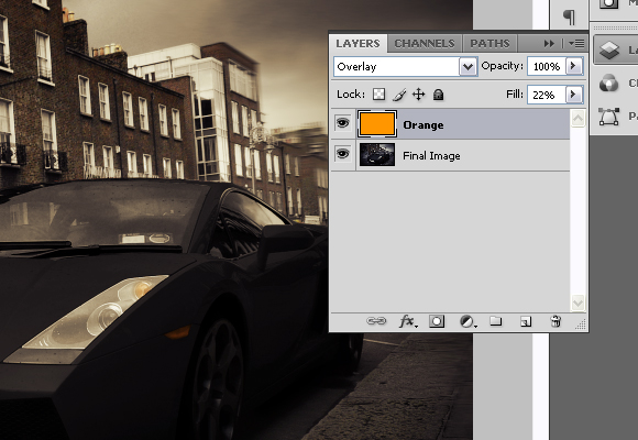 Step 40Now using Type Tool (T), in the upper left corner type “Lamborghini”. Go to Character window and for font set “Champagne”, for size 100pt.  Step 41And finally, right click on the text layer and go to Blending options and set the following values. 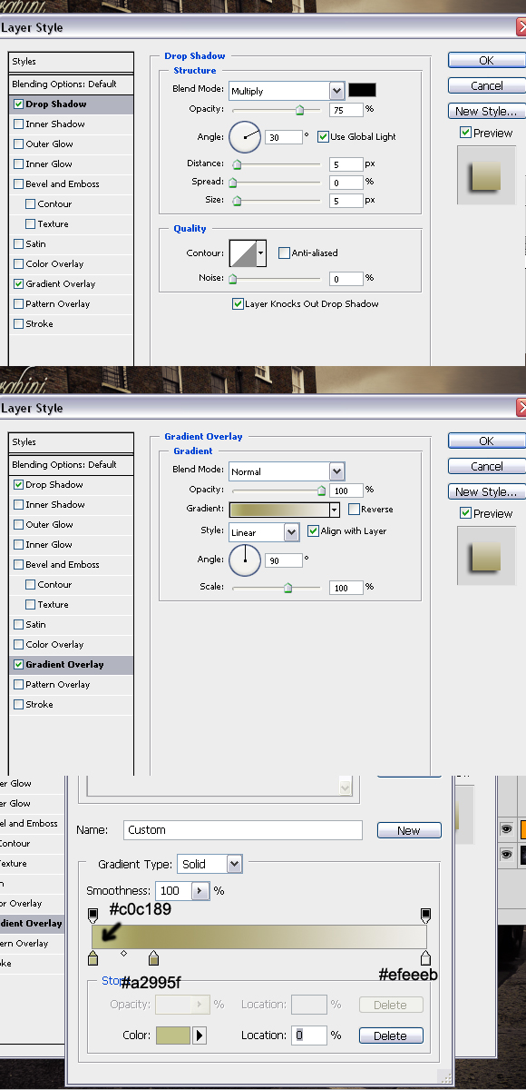 Final ImageThe final effect can be seen below. Thanks for reading the tutorial and I hope you liked it. 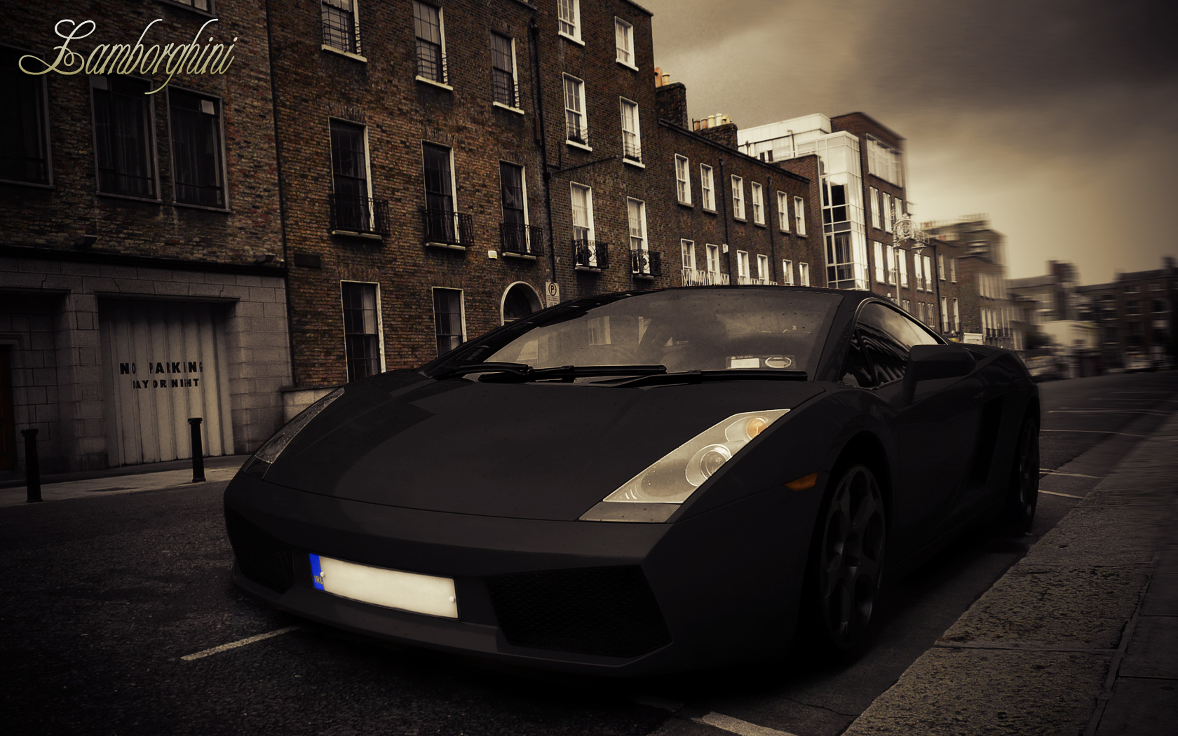 |
| Quick Tip: Create a Seamless Wood Tile in Minutes Posted: 09 Sep 2010 09:30 AM PDT I use to do quite a bit of work with 3D models and texturing was something that I did on just about all my projects. The biggest problem most people have with creating seamless tiles in Photoshop is getting rid of the seam, especially with small file sizes. Today, I will demonstrate a technique that will get rid of the seam every time. Let’s get started!
Step 1To begin, open up the texture you’d like to create a tile from. Any texture will do, for this example I chose a wooden background. 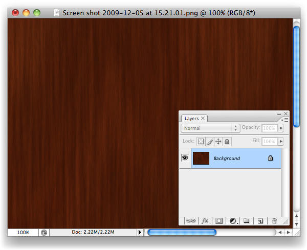 Step 2Create a new document 400 x 400 pixels.  Step 3Crop the background layer down, if necessary and double click the background layer to unlock it and turn it into a regular layer. 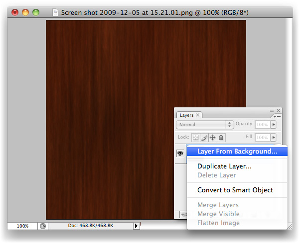 Step 4With the Marquee Tool, grab the entire right-hand side of the canvas.  Step 5Cmd/Ctrl + X to Cut the selection away. You’ll be left with the left side of the image, on your "Layer 0". 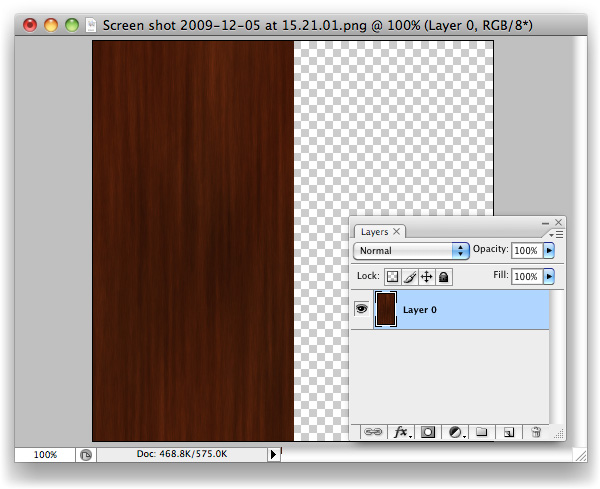 Step 6Cmd/Ctrl + V to Paste the selection that you just cut out back onto the canvas. It’ll be its own layer now, "Layer 1". You’ll want to drag it right over to where "Layer 0" is with the Move tool, snap it tight with the left-hand side of your canvas. 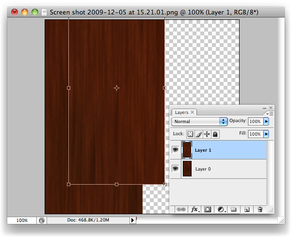 Step 7Now select "Layer 0", and Move its contents over to where the right-hand side used to be. 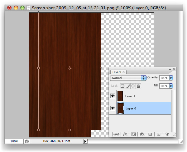 Step 8What we have here now is the original image, sliced in half, with its pieces put in the wrong places. Amazingly, the background that I chose actually looks spot on after having done this, but you’ll likely see a seam of some sort along the centre.  Step 9With "Layer 1" selected, hit Cmd/Ctrl + E to Merge Down the layers on top of one another. 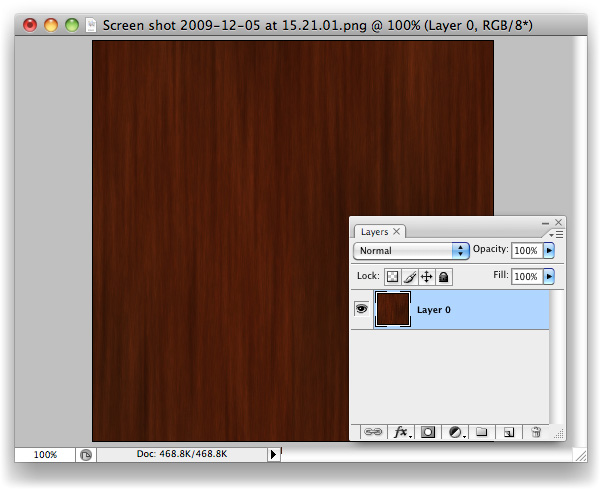 Step 10We’re going to repeat the process once more, but vertically rather than horizontally. Grab the bottom half of the image with the Marquee tool (M). 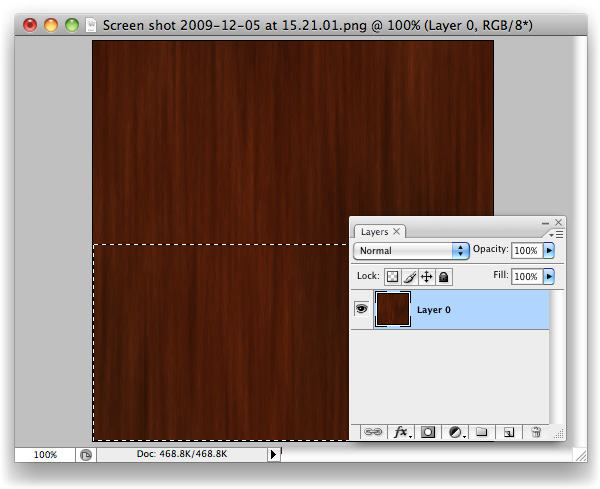 Step 11Like last time, cut this selection out. 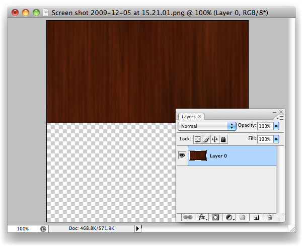 Step 12Paste the bottom back in as a new layer and Move (V) it up so that it snaps tight with the top of the canvas, on top of "Layer 0". 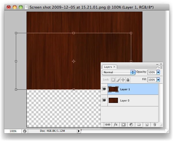 Step 13You should be able to guess what’s coming next? If so, you’re getting it, and this trick will soon be baked onto your brain and will, hopefully, save you lots of time in the future. 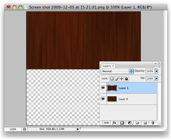 Step 14Move (V) the contents of "Layer 0" down and snap it tight with the bottom of the canvas, where "Layer 1"’s content used to be.  Step 15Here we go, check out that beauty of a seam. You’ll likely have two of them running through your image, whereas I’ve been fortunate enough to only have one (I still can’t believe the first cut was so clean!) What we’ve done is basically mimic the effect we would normally only see once we’ve applied a tiled image, and wonder how on earth to fix it. The edges of this image will tile perfectly, however, as we’ve moved the nice-and-tidy central area of the image over to the borders, and the original seams through into the centre of the canvas. Now we know that the problem areas are in plain sight, we can sort them out. 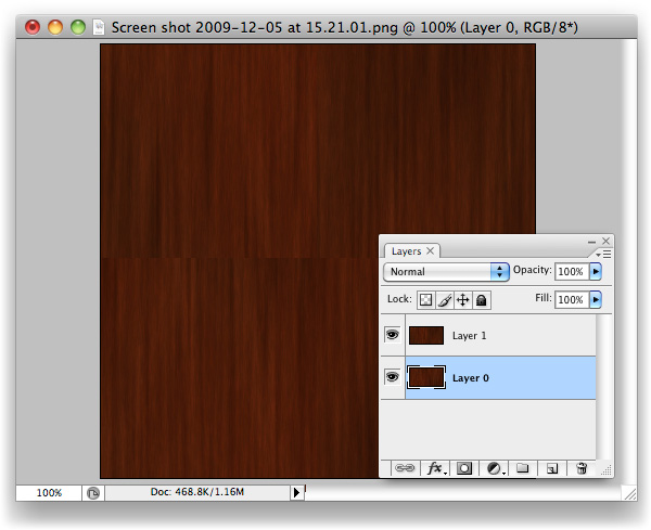 Step 16Paste again. You’ll have "Layer 1" twice now, this second instance named "Layer 2". 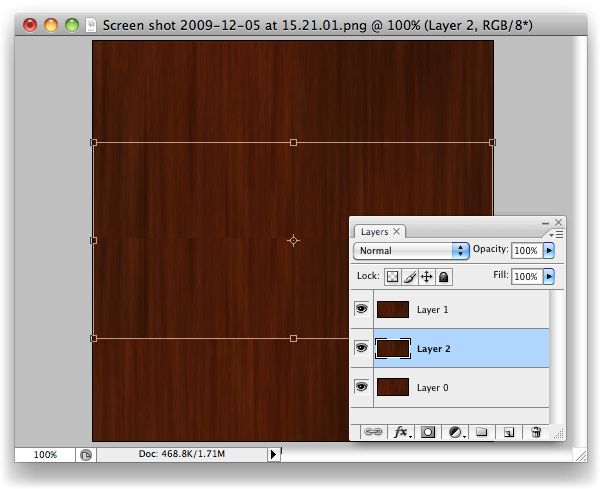 Step 17Drag "Layer 2" up to the top of the layer stack (just grab it in the layers palette, move upward.  Step 18Make a Mask on "Layer 2". It’s the third icon along at the bottom of the layers palette. Looks like a moon in a dark sky.  Step 19With the Gradient Tool selected and Black > Transparent selected as the colour to be used with gradients, simply drag from the top of "Layer 2" down to about where I did in the screenshot. 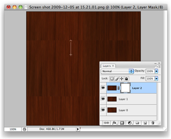 Step 20Same again with the bottom of "Layer 2", but upwards.  Step 21Duplicate the new "Other Page" layer, and drag it underneath the original. Using the Levels panel (Command + L), drag the black Input Level over to the right and the white Input Level to the left slightly like in the image above to increase the intensity of the Gradient. Nudge this layer down slightly from the original "Other Page" layer, to reveal the second "Other Page". The increased intensity of this layer’s Gradient allows the effects of the gradient to be visible in this small space. 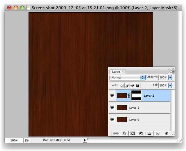 Step 22At this stage, you’ve done all the legwork you should have to. If the gradients have left a sort of mushy, blurry edge, use a Brush and work into the mask a little to break the progressive line into a more choppy one. That should be all that’s needed to disguise the seam.  Final ImageYou’ll now have your very own tiling image with seamless seams. More importantly, you should have a new trick up your sleeve that will hopefully save you lots of time in the future.  |
| The Making of Rapture – Psd Premium Tutorial Posted: 09 Sep 2010 06:15 AM PDT Today, we have another Psd Premium tutorial exclusively available to Premium members. If you want to take your photo manipulation skills to the next level, then we have an awesome tutorial for you. Learn more after the jump!
This Premium Tutorial is Filled with Creative TipsIn today’s premium tutorial, we will demonstrate how to successfully create this epic scene in Photoshop. This piece involved the use of several stock images and is loaded with useful tips and tricks. It took several days to complete, so let’s stop fooling around and get started! Professional and Detailed Instructions InsidePremium members can Log in and Download! Otherwise, Join Now! Below are some sample images from this tutorial. 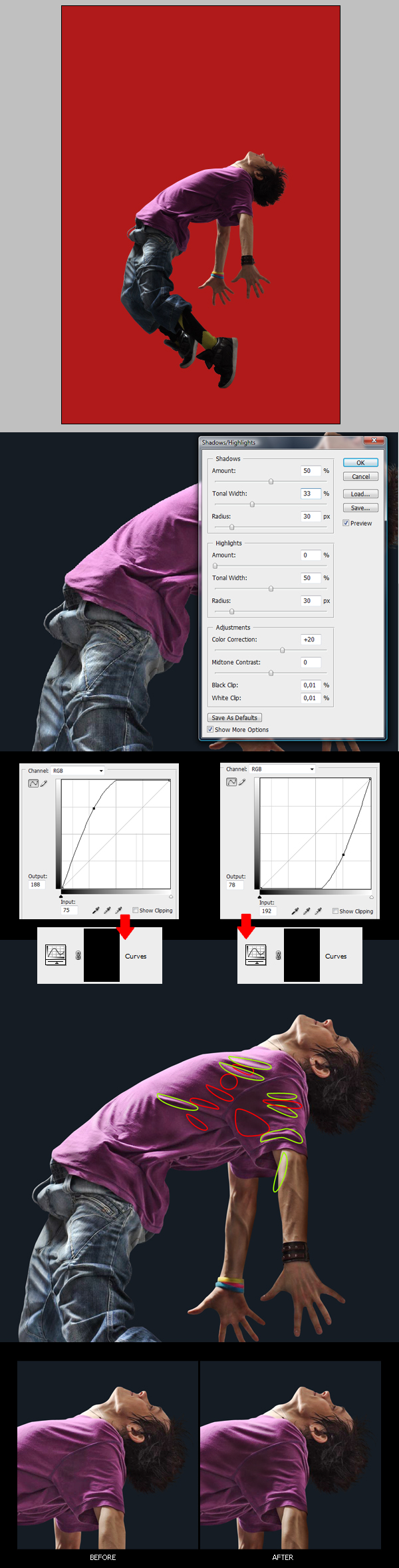 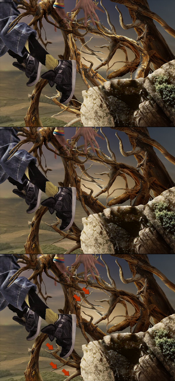  Psd Premium MembershipAs you know, we run a premium membership system here that costs $9 a month (or $22 for 3 months!) which gives members access to the Source files for tutorials as well as periodic extra tutorials, like this one! You’ll also get access to Net Premium and Vector Premium, too. If you’re a Premium member, you can log in and download the tutorial. If you’re not a member, you can of course join today! |
| You are subscribed to email updates from Psdtuts+ To stop receiving these emails, you may unsubscribe now. | Email delivery powered by Google |
| Google Inc., 20 West Kinzie, Chicago IL USA 60610 | |