PSDTUTS Updates |  |

- Quick Tip: Apply a Burned Effect to Different Textures
- Render a Stunning Space Cadet Illustration in Photoshop – Psd Premium Tutorial
- Psdtuts+ Welcomes New Editor, Grant Friedman
- Create a Camera Lens Icon in Photoshop – Screencast
| Quick Tip: Apply a Burned Effect to Different Textures Posted: 16 Sep 2010 09:30 AM PDT The Burn Tool is a very powerful feature in Photoshop’s toolbox. In today’s tutorial we will demonstrate how to quickly burn an object into two different textures. Let’s get started!
Resources UsedStep 1 – TextileWe’ll start with a textile fabric; you can find the texture here. The size of the document doesn’t matter, so you can work directly with the size of the texture, If you want to print it, work with CMYK, if not, work with RGB; we are going to experiment, so you can work with anything you like, such as 1 color logos, type, or vectors. In my case, I used the Psdtuts logo.  Step 2 – TextileWe need to prepare the logo to blend into the texture by creating a Displacement Map, this will alter the silhouette of the object, making it irregular and leaving it ready to work within the texture. Duplicate the texture layer and desaturate (Cmd/Ctrl + Shift + U); then select the desaturated layer (Cmd/Ctrl + A), copy the layer (Cmd/Ctrl + C), make a new document (Cmd/Ctrl + N) and paste it inside (Cmd/Ctrl + V), save it as displace.psd and close it.  Step 3 – TextileNow, let’s apply the displacement map to the logo, select the object you are working with and go to filter. Go to Filter > Distort > Displace, then in the Displace Window type 3 on horizontal and vertical scale, make sure the options Stretch to Fit and Repeat Edge Pixel are selected too, and select ok; then you will select the displacement map you made for this texture (displace.psd) and select open; after doing this step, take a look at the result, if it’s too distorted, perhaps you will have to try one value down, if it’s not much of a change, then, you need to go up on the values.  Step 4 – TextileNow we are ready to start making the burn effect. Keep in mind that this effect involves a little bit of practice with the burn tool, this is because the Burn Tool reacts differently with each texture, this also depends of the Range and Exposure of the brush you are using, so it’s not certain to get the result you expect. Before you start, remember that you will be burning the texture, this means that you can’t go back, modify or move the burn, so I suggest you duplicate the texture and give it a try with the Burn Tool, once you got the feel of it, duplicate a clean texture and layout all the things you are about to burn in the place you want them. I recommend to use soft brushes and do a few passes playing with the Range (Highlights, Midtones and Shadows) as well with the Exposure and size of the brush. This effect needs practice and detail to really make it look really good. Let’s make a selection of the object, in this case the logo and then move to the texture layer, select the Burn Tool and start exploring how it behaves.  Step 5 – TextileAfter you’ve got the result you are looking for with the Burn Tool it should look similar to this result that blends with the texture; this can work by itself, but we can still make it better by adding some lights and shadows. Duplicate the texture and move it above all layers and name it Overlay, then Desaturate (Cmd/Ctrl + Shift + U), change Layer Blend Mode to Overlay at 40% Opacity. Make a new layer above the Overlay layer, select a soft white brush and make it a size that can fit all the object, brush blend mode set to Normal and 100% Opacity; then set the Layer Blend Mode to Overlay at 40%. We are now finished with the textile texture.  Step 6 – PaperLet’s move on to a paper texture, the process will be exactly the same as it was with the textile texture, just remember to explore how the Burn Tool will react with the paper texture; to make it more interesting, we will blend some paper textures and play around with the Hue and Saturation as well with the Burn Tool to make an interesting texture to work with. You can find some interesting textures here (old paper) and here (texture paper); make a new document and put them together, we’ll use shape of the texture paper (make them the same size no matter if you stretch them to fit), make a selection of the texture paper silhouette, select the old paper and Inverse the selection (Cmd/Ctrl + Shift + I) and erase, you will end up with this.  Step 7 – PaperRemember that this is a new texture, so you have to test how the burn will work on it, so duplicate this layer just in case. The old paper texture looks very pale, go ahead and play with the Hue and Saturation (Cmd/Ctrl + U), then with the Burn Tool go work on the edges to burn and some parts of the center too. Move the texture paper above and set the Layer Blend Mode to Linear Burn at 90% Opacity, duplicate the layer (same blending mode) at 90% Opacity, it will look something like this.  Step 8 – PaperTo save some time and steps, let’s use the same object you used in the earlier exercise, it will already have the displace filter applied to it to make it blend with the texture. Remember to duplicate the old paper texture to practice, then make a selection of the object and start burning, pay attention how the burn tool reacts with this new texture, when you are done, it should look something similar to this.  Step 9 – PaperNow we have a good burn on paper that can work, but let’s add some more details for a better result. Duplicate the texture paper and move it above all layers and name it Overlay, then Desaturate (Cmd/Ctrl + Shift + U), change Layer Blend Mode to Overlay at 40% Opacity. Make a new layer above the Overlay layer, select a soft white brush and make it a size that can fit all the object, brush blend mode set to Normal and 100% Opacity; then set the Layer Blend Mode to Overlay at 40%.  Final ImageNow that you know the power of this tool, keep exploring it; check out the results you can achieve with this tool, here are some examples I made. This is a very basic and easy effect, just need some experimentation in order to get the feel of the Burn Tool, it has a lot of potential if you know how to use it and how to combine it to get awesome results. I encourage you to give it a try on new textures, see how it works, keep trying and practicing; sometimes basic things are the ones that take the final piece to another level; if you want to keep trying out this tool with other textures I recommend you check out CG Textures.  |
| Render a Stunning Space Cadet Illustration in Photoshop – Psd Premium Tutorial Posted: 16 Sep 2010 05:00 AM PDT Today, we have another Psd Premium tutorial exclusively available to Premium members. If you want to take your illustration skills to the next level, then we have an awesome tutorial for you. Learn more after the jump!
This Premium Tutorial is Filled with Creative TipsToday’s tutorial will focus on the capabilities of Photoshop as a rendering tool to bring your vector illustrations to life utilizing raster effects. With just a few coloring techniques, namely adjustment layers, layer masks, and layer styles; you’ll notice that the process can become quite repetitive thus making it a fairly intuitive and efficient workflow. This tutorial was written by Kervin Brisseaux who is a digital Illustrator from New York. He is a senior member of The Depthcore Collective and is currently pursuing a Masters Degree in Architecture at Syracuse University. Lately, he has been involved in various freelance projects for clients such as Nike, Axe Bodyspray, and Aquafresh. For more examples of Kervin’s work, check out his portfolio at Brisseaux.com. Professional and Detailed Instructions InsidePremium members can Log in and Download! Otherwise, Join Now! Below are some sample images from this tutorial. 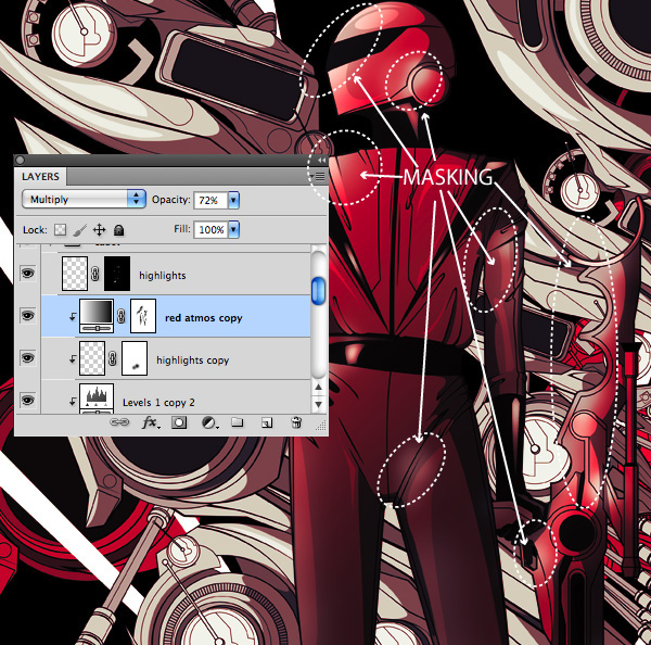 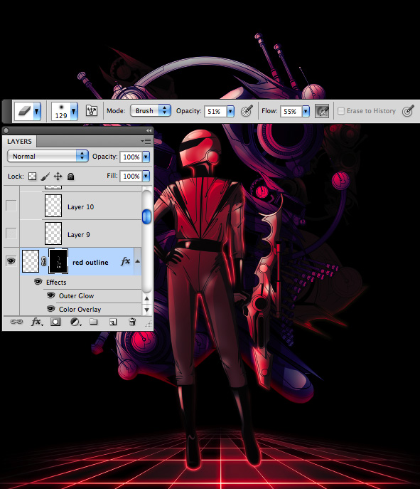 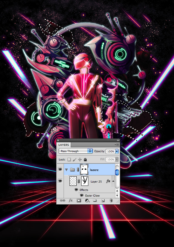 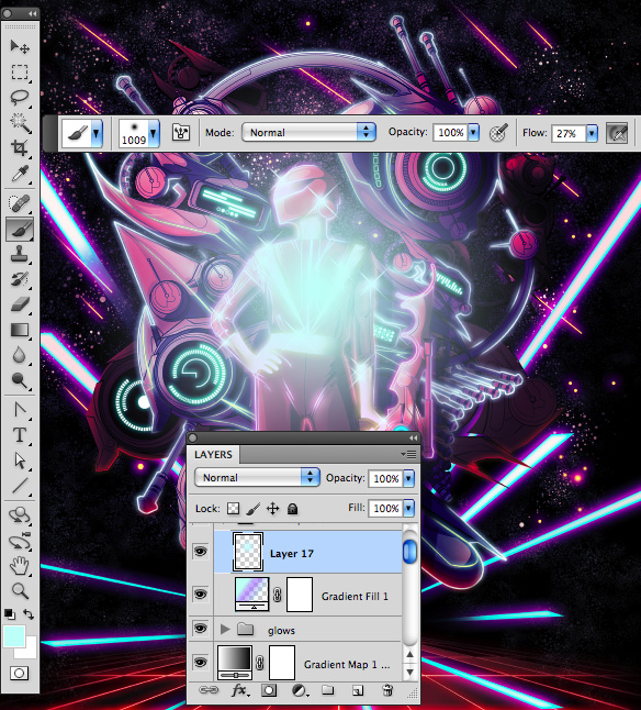 Psd Premium MembershipAs you know, we run a premium membership system here that costs $9 a month (or $22 for 3 months!) which gives members access to the Source files for tutorials as well as periodic extra tutorials, like this one! You’ll also get access to Net Premium and Vector Premium, too. If you’re a Premium member, you can log in and download the tutorial. If you’re not a member, you can of course join today! |
| Psdtuts+ Welcomes New Editor, Grant Friedman Posted: 15 Sep 2010 10:00 AM PDT If you follow us on Twitter or Facebook, you may already be aware that Psdtuts has a new editor. In fact, this is kind of old news. Grant actually began his editing duties for Psdtuts on August 1 and has been quietly editing the site ever since. Before that time, Grant worked as the Associate Editor for this site under Sean Hodge; who is now heading up the new Tuts+ Marketplace, as well as Vectortuts.
You may already be familiar with Grant. For the last few years he has maintained Colorburned, another popular design blog. He is a very active member of the design community, is an active Twitterer and brings loads of blogging experience to the table. Psdtuts is in good hands with Grant and we are very excited to have him at the helm. Since taking on the Lead Editor role, Grant has taken on a more active role on both our Twitter and Facebook pages. Please feel free to connect with us on both networks to learn more about what's happening on Psdtuts. Some Interesting Facts About Grant
New Author RecruitmentWe are always looking for new writers here at Psdtuts. We work with a fantastic team of regular authors but we love working with new people as well. So if you've been on the fence about writing an article or tutorial, now is a great time to give it a try. To learn more about writing for Psdtuts, visit our Write for Us page or just Submit an Idea. Envato Remote Staff MeetupWe also thought that we would let you know about another exciting event here at Envato. Last week we held our first ever remote staff meetup in Chicago. This was the first time that the remote staff got to meet each other in person. We had Envato staff travel all the way from Australia, Europe, and Canada and it really was a fantastic experience. Now that everyone has had a chance to meet in person, we hope to do much more collaboration with the other tuts sites as well as the marketplaces. Hopefully, there will be more meetups in the near future. Until then, you can view photos of the event here. Anyhow, that's all for now. Thank you all so very much for the loyal readership. It means so much to us. Don’t Forget to Like UsPlease don’t forget to like us on Facebook! |
| Create a Camera Lens Icon in Photoshop – Screencast Posted: 15 Sep 2010 06:05 AM PDT Icon design is a fun but detailed process. In this tutorial, we will demonstrate how to create a camera lens icon using Photoshop. Let’s get started!
|
| You are subscribed to email updates from Psdtuts+ To stop receiving these emails, you may unsubscribe now. | Email delivery powered by Google |
| Google Inc., 20 West Kinzie, Chicago IL USA 60610 | |